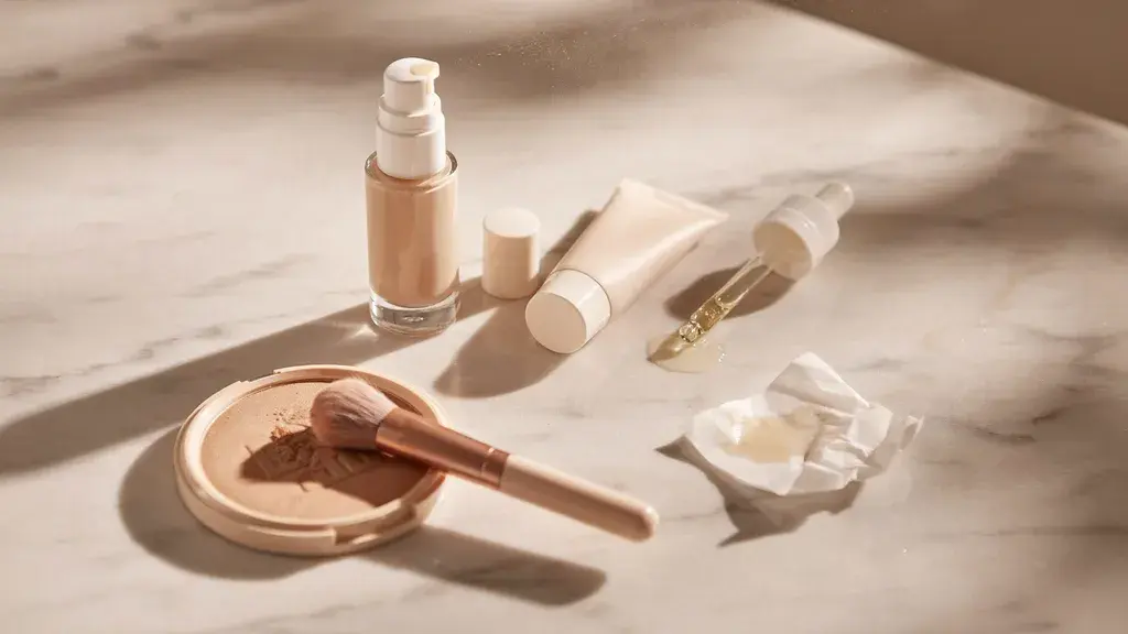
Walk down any beauty aisle, and you’ll instantly make judgements on products without reading a single label. “That looks expensive”, “That looks too unhealthy”, “That looks poor quality”.
However, these are all assumptions. Assumptions based on colour signals. What the product looks like, how it’s presented, and what colours they use. It doesn’t come from the actual ingredients or claims.
Why Colour Gets There First
Colours are processed faster than text, meaning they do the work before anything else registers.
Think about it. A can of dark red coloured drink can look unhealthy, so many healthy drinkers will dismiss it before looking at the ingredients. If they look closer, though, they may come to find it’s a zero-calorie drink.
A systematic review of packaging research published in 2023 looked at packaging colour. They found that consumers judge products based on what they look like, without even consciously reading the product itself.
Cosmetics Rely on It More Than Almost Anything
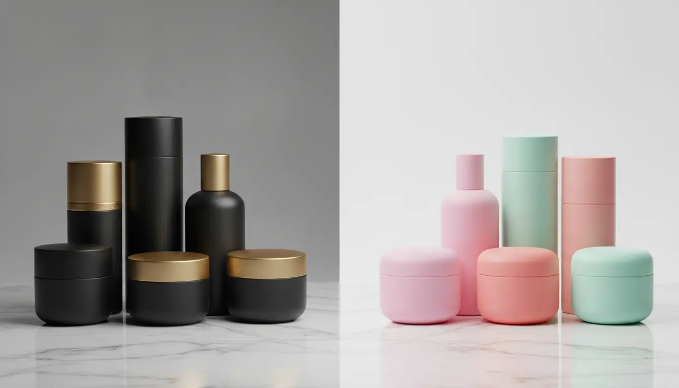
Frosted glass, matte black, and metallic detailing, etc., place a lot of cosmetic products in the premium bracket. Bright plastic and rounded shapes often signal fun and affordability.
Two very different products from the outside, targeting two different audiences. However, the actual formula inside can be similar. Despite this, one will be looked at as high-quality while the other is seen as poor quality, even though they are the same.
What separates them is the packaging. One provides a premium feel, and the other, affordability. Both work for two different individuals, even though they may have the same underlying properties.
Fashion Uses the Same Shorthand
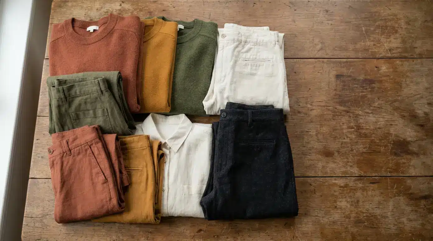
Fashion follows the same rules. Earth tones read as autumn, yellows and whites read as summer, and darks read as winter.
Colours tell us something without physically saying it, enabling us to wear products that suggest certain seasons, feelings, or emotions.
Research into clothing consumption has even found that colour choice connects closely to identity, mood, and even weather conditions.
The Same Rules Apply Well Beyond Beauty
These colour signals aren’t confined by what we wear or apply, either. The same rules apply to all industries.
Food and drink packaging, for example, leans on them constantly. Green is used for health positioning, gold for premium, and red for indulgence.
Digital catalogues work the same way. Browse a hub of themed slot games, and you’ll quickly see what these games are about without even playing them. You’ll see jungle themes using earthy tones like green and brown, Dracula themes using light greens and dark purples, and Egyptian themes using yellows, light blues, and reds.
The reason the same rules apply is that they’re all seeking attention, visual attention. And the quicker somebody can visually recognise what your product/service is about, the better.
Why Designers Rarely Break the Rules
Rules that work don’t get broken. That’s why designers, whether for beauty packaging, clothing, or even games, focus so heavily on colour psychology.
By using colour correctly, we’re able to give context without text. It helps tell a story without saying anything, which may just be the difference between a consumer choosing their product/service over somebody else’s.