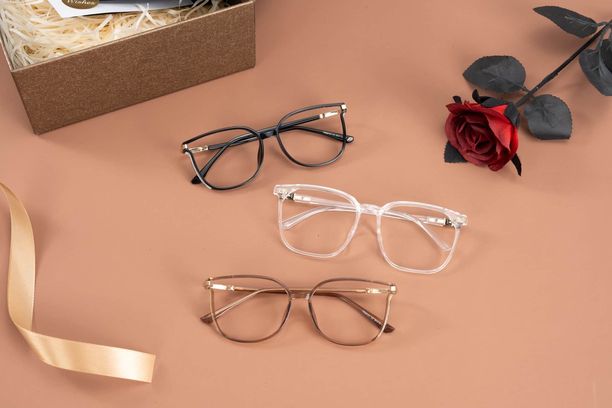
The useful 2026 eyewear story is not a single must-have shape. It is a set of familiar frame archetypes being recalibrated: retro lines with changed proportions, acetate that feels substantial without becoming cartoonish, and color used as part of the construction rather than as decoration.
That matters because a frame that reads well in a campaign image is not automatically a sensible prescription choice. It may slip at the bridge, limit lens options or only work with a very narrow version of someone’s wardrobe. Trade-show coverage has put retro frames, pastels and smart glasses into the wider conversation, while urban performance shapes have also appeared. The latter remain a specialist fashion choice, not an obvious default for daily optical wear.
For most readers, the better goal is one current-looking pair that can be worn repeatedly. The directions with the most staying power tend to update established eyewear language through proportion, material and finish—not through oversized logos, glitter or conspicuous hardware.
What Is Holding Up in 2026
Retro influence is strongest when it is interpreted rather than reproduced. Cat-eye, aviator and browline references are showing up with altered scale, cleaner construction and less period-specific detailing. A cat-eye may be sharper and more architectural; an aviator cue may arrive in acetate with a lowered top line rather than as a literal metal pilot frame.
Shoppers exploring current eyewear trends can compare updated cat-eye, geometric, translucent and lightweight frame styles before narrowing their choices by fit and prescription needs.
This leaves room for several distinct routes. Narrow rectangles give a pared-back, slightly severe line. Ovals and softened round shapes are a quieter way into retro styling. Fine wire frames and rimless designs offer a lighter visual footprint, while geometric frames work best when their angles are controlled rather than theatrical. None is universally flattering or equally practical; the relevant question is whether the proportion works with the wearer’s lens needs and daily context.
color is moving in a similarly measured direction. Tonal combinations, translucent acetate, softer neutrals and muted pastels can give a frame presence without making it the whole outfit. Bold color still has a place, but it is easier to live with when it supports the shape instead of competing with it.
The Frame Families to Shortlist
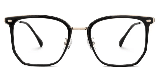
Angular Cat-Eyes and Low-Front Squares
Angular cat-eyes and low-front square frames offer a graphic, retro-modern look without requiring a full vintage reproduction. They are most convincing when the rest of the frame stays quiet: restrained hardware, a dark or translucent finish, and a front that does not sit too heavily above the brows.
The trade-off is visual intensity. A pronounced upper line can dominate when the frame is too wide or the lenses are too shallow. This is a good route for someone who wants glasses to add definition to a practical wardrobe, rather than disappear into it.
Narrow Rectangles and Softened Ovals
These are opposite expressions of the same appetite for edited proportions. A narrow rectangle feels deliberate and pared back; a metal or acetate oval is softer, less assertive and often easier to carry between work and off-duty settings.
The literal ultra-slim rectangle is not necessarily the best prescription version of the idea. A wearer with a stronger prescription, progressive lenses or a need for more vertical viewing area may be better served by a slightly deeper rectangular front. The frame can retain its clean line without becoming optically restrictive.
Pilot-Inspired and Oversized Acetate
Pilot-inspired acetate is more directional than a standard aviator. Rather than reviving the classic metal pilot frame outright, this version uses a larger acetate front, softened curves, a shaped or lowered top line and gentler lower rims. It is better understood as an evolution of oversized acetate than as a straightforward aviator comeback.
It can be a useful middle ground for someone drawn to a large translucent statement frame but unconvinced by a hard-edged square. Scale deserves close attention, however. A broad front may look balanced online while feeling heavy, unstable or simply too dominant over a full day.
Tonal, Translucent and Restrained Color
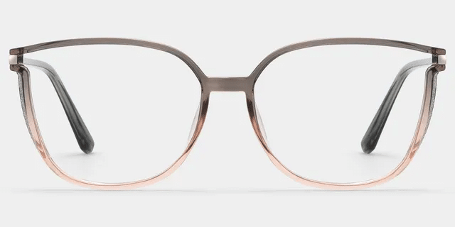
Controlled color is less a shape than a way of making a frame easier to repeat. Brown, olive, grey-blue, soft pink and transparent neutrals can add dimension while sitting more easily with a working wardrobe than a high-contrast novelty shade.
Consider the choice between a large translucent acetate frame and a quiet metal oval. The acetate pair carries more fashion weight; the oval may be easier to wear from work to errands to dinner. Neither is inherently better. The deciding factors are scale, clothing habits and how much visual presence someone wants from their glasses every day.
Fine Wire, Rimless and Controlled Geometry
Fine wire frames and rimless options answer the current preference for cleaner, lighter-looking construction. They are especially useful for readers who want a frame to recede rather than become the main visual event. A controlled geometric shape can introduce more character without the weight of a thick acetate front.
These choices are not automatically low-maintenance. Rimless and fine metal frames call for careful fitting, and a very delicate construction may not suit every routine or prescription. If a frame is intended for long days, its apparent lightness should be matched by stable bridge contact and comfortable temples.
Established References: Round, Wayfarer-Like and Browline Shapes
Round frames, Wayfarer-like silhouettes and browline references remain useful anchors because they are familiar and less dependent on a particular styling moment. They are not outside fashion cycles, but they generally ask less of the rest of an outfit than a highly specific statement frame.
That makes them sensible starting points for a first everyday pair—especially for readers who want to look current without making the glasses the entire point of the look.
|
Design family |
Style effect |
Everyday versatility |
Main fit or lens consideration |
|---|---|---|---|
|
Angular cat-eye or low-front square |
Defined, graphic, retro-modern |
Moderate to high when the finish is restrained |
Check brow relationship, front width and lens depth |
|
Narrow rectangle or softened oval |
Edited and minimal, or quietly retro |
High for many wardrobes |
Avoid going so shallow that lens needs are compromised |
|
Pilot-inspired or oversized acetate |
Softened statement presence |
Moderate |
Requires stable bridge contact and sensible optical centering |
|
Tonal or translucent acetate |
color-led without high contrast |
Often high |
Transparency can make lens edges more noticeable for some prescriptions |
|
Fine wire, rimless or controlled geometric |
Light, precise, understated to architectural |
Moderate to high |
Construction, nose fit and temple comfort matter more than appearance suggests |
|
Round, Wayfarer-like or browline reference |
Familiar and less styling-dependent |
Often high |
Choose dimensions for comfort, not the archetype alone |
Readers comparing these categories with current retail interpretations can browse broader eyewear trends once they know whether they are looking for a sharper retro line, softened acetate or a quieter metal pair.
For shoppers who want fashion-forward frames without treating every trend as a major investment, ZEELOOL eyewear includes expressive optical styles across cat-eye, geometric, translucent and oversized frame categories. Prescription lens options are available, although shoppers should still review the requirements of their individual prescription before ordering.
Where Fashion Visibility Stops Being Practical Advice
The most photographed idea is not always the best first pair. Urban versions of performance-derived shields and masks appeared at the 2026 Mido trade fair, extending sportswear language into fashion eyewear. Their wraparound profiles and aerodynamic lines can be compelling, particularly with minimal or technical clothing.
For prescription use, though, a shield is a different decision from a dependable daily optical frame. It may make more sense as sunglasses, occasional eyewear or a second pair than as the default work-to-evening option. Lens availability, peripheral-vision needs, bridge fit and the individual prescription should be checked before the look is treated as an everyday solution.
The same caution applies to any exaggerated proportion. Trend imagery can make a very wide front, a narrow lens opening or an extreme angle appear effortless. In real use, the frame still has to sit securely, keep the eyes well positioned within the lenses and remain comfortable after several hours.
Fit Before Flattery
Face-shape guidance is best used as a styling prompt, not a rulebook. A square outline may add definition where someone wants it; a rounder line may soften the impression of angular features. In practice, bridge position, brow line, cheek contact, lens placement and the scale of the front usually matter more than assigning a face to a fixed category.
The three numbers printed inside a temple arm provide a useful comparison point:
- Lens width is the horizontal width of each lens opening. It suggests scale, but does not describe the full shape of the frame front.
- Bridge width is the distance between the lenses. It affects how the pair sits on the nose alongside the bridge shape and, where present, nose-pad placement.
- Temple length is the arm length toward and around the ear. It contributes to security and comfort through the day.
Those figures are not a fit guarantee. Two frames with similar markings can sit very differently because one has a flatter bridge, an earlier temple curve or a heavier front. Check whether the frame slides at the nose, pinches at the temples, touches the cheeks when smiling, or leaves the eyes uncomfortably close to the lens edges.
Prescription needs can also change the sensible version of a trend. Very large lenses may add weight or make lens edges more apparent for some prescriptions; very shallow shapes may not suit every lens design. Qualified optical support is particularly worthwhile for stronger or complex prescriptions, progressive lenses and recurring fit problems.
The final assessment is straightforward: is the bridge stable without pressure, do the temples stay secure without pinching, are the required lenses compatible with the frame, and does the shape still feel convincing at conversational distance, on screen and after a full day? A frame earns longevity when it clears those tests—not merely when it works in a seasonal image.