Khaki isn’t just one color. It’s a whole family of earthy shades, from soft cream to deep olive green.
You’ll spot it on your favorite pants, in military uniforms, and across home decor that never really goes out of style.
It sits somewhere between tan and olive, warm but never loud, which is exactly why it works with almost anything.
Once you understand what makes khaki tick, picking the right shade for your outfit or your living room gets a lot easier. Let’s get into it.
What is Khaki Color?
Khaki is a light brown color that sits somewhere between tan and olive green.
While many people think khaki is just one specific color, it’s actually a family of similar shades that can range from yellowish-brown to greenish-brown.
In fact, different design tools define “khaki” with noticeably different hex codes; Canva and the CSS/X11 web standard use #F0E68C, while Figma lists khaki as #D5C58A, and both Muzli and Adobe Express use the browner #C3B091.
There’s no single “official” khaki; it depends on which system you’re working in.
Khaki also blends beautifully with many earthy color palettes, making it a versatile neutral for fashion and interiors.
Khaki often gets confused with other neutral colors, but there are subtle differences. Beige is lighter and more cream-colored, while tan is warmer with more orange undertones. Olive has more green in it, making it darker than typical khaki.
Think of khaki as the middle ground between all these colors; it’s not too light like beige, not too warm like tan, and not too green like olive. This versatility makes khaki a popular choice for clothing and home decor.
The History and Origin of Khaki
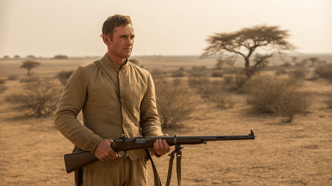
The word “khaki” has an interesting story that started long ago. It comes from the Persian and Urdu languages, where it meant “dust” or “soil.” This makes perfect sense when you see the color; it really does look like dusty earth!
The British Army was the first to use khaki for uniforms in the 1840s, when it was fighting in India.
Soldiers needed clothing that would help them blend in with the dusty landscape, so khaki was the perfect choice. After proving useful in wars, khaki slowly moved from battlefields into everyday life.
By the early 1900s, khaki clothes became popular among the general public because they were practical and looked good. Today, you can find khaki everywhere, in pants, shirts, home decorations, and even cars.
What started as military camouflage became one of the world’s most popular neutral colors.
Khaki in Color Psychology
Colors affect how we feel and think, and khaki has some special meanings in color psychology. This earthy tone sends certain signals to our brains, making it perfect for specific types of businesses and designs.
- Calm and Peaceful – Makes people feel relaxed it reminding them of natural elements like sand and soil.
- Trustworthy and Reliable – Suggests stability and dependability, which is why work uniforms often use khaki.
- Down-to-Earth – Represents being practical and humble rather than flashy or attention-seeking.
- Connected to Nature – Looks like earth and natural materials, making people think of the outdoors.
This is why so many eco-friendly companies and outdoor brands choose khaki for their logos and marketing. The color automatically signals to customers that the brand cares about nature, quality, and practicality.
Khaki vs. Khaki Color: Is There a Difference?
Many people get confused when they hear “khaki” and “khaki color” because they can mean different things depending on where you use them. Here’s a simple breakdown to help you understand the difference:
| ASPECT | KHAKI (GENERAL TERM) | KHAKI COLOR (DIGITAL/DESIGN) |
|---|---|---|
| Definition | A wide range of earthy neutral tones | Specific digital color (#F0E68C) |
| Color Range | Beige to olive green variations | Light yellowish-green shade |
| Common Use | Fashion, clothing, home decor | Web design, graphic design, digital art |
| Appearance | Dusty brown to greenish-brown | Pale yellow-green, lighter tone |
| Industry | Fashion and retail | Technology and design |
| Flexibility | Many shades under one name | One exact color code |
| Examples | Khaki pants, military uniforms | Website backgrounds, digital interfaces |
Now you know why someone talking about khaki pants might mean something completely different from a web designer using “khaki color” on a website. Both are correct; they’re just used in different worlds!
Khaki Color Codes & Variations
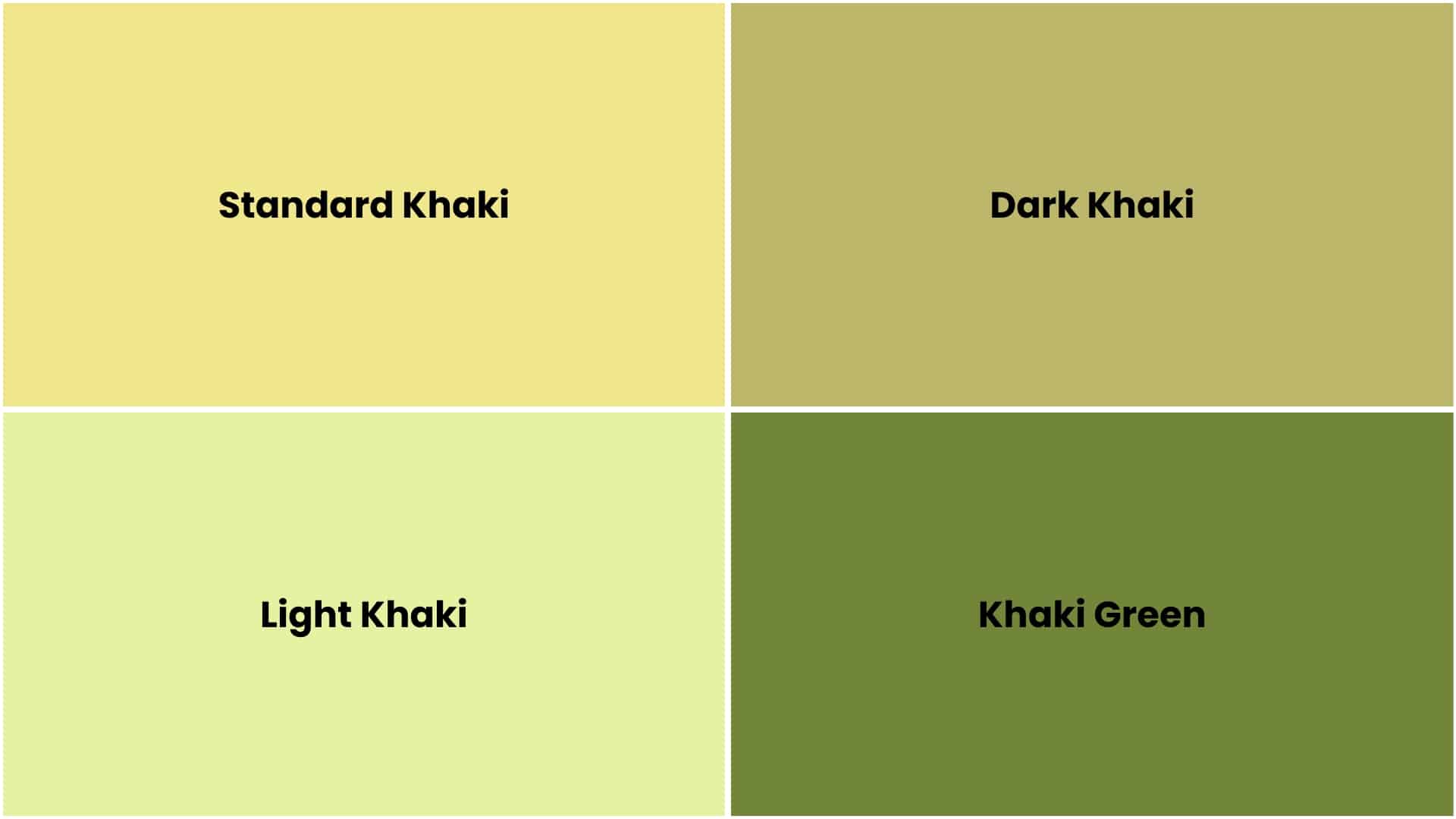
Understanding khaki color codes is important for designers, artists, and anyone working with colors on computers. These codes ensure you get the exact shade every time, even if you’re designing a website or choosing paint colors.
- Standard Khaki (#F0E68C) – Light yellowish-green, perfect for website backgrounds and soft designs.
- Dark Khaki (#BDB76B) – Deeper brownish tone, great for text and borders that need to stand out.
- Light Khaki (#E6F2A2) – Very pale and cream-like, ideal for subtle backgrounds.
- Khaki Green (#728639) – More green tones, works well for nature themes and military-style looks.
- Color Values – Each shade has RGB, CMYK, and HSL numbers for screens, printing, and web design.
These different shades of khaki give you plenty of options for your projects. Light khaki works best for backgrounds, while dark khaki is great for headings and important text that needs to be easy to read.
What Does Khaki Look Like on Digital Screens?
The khaki color you see on a phone, computer, or tablet depends on its digital color values. Designers use standardized codes so the shade appears consistent across websites, apps, and graphics.
For the standard web khaki color, use:
- HEX: #F0E68C
- RGB: 240, 230, 140
- HSL: 54°, 77%, 75%
- CMYK: 0%, 4%, 42%, 6% (approximate for print)
Keep in mind that screen brightness, display calibration, and dark mode settings can make khaki appear slightly warmer, cooler, or more muted on different devices.
Design Tip: Because khaki is a light color, pair it with dark text such as charcoal or deep brown to improve readability and meet accessibility standards.
Colors that Go with Khaki
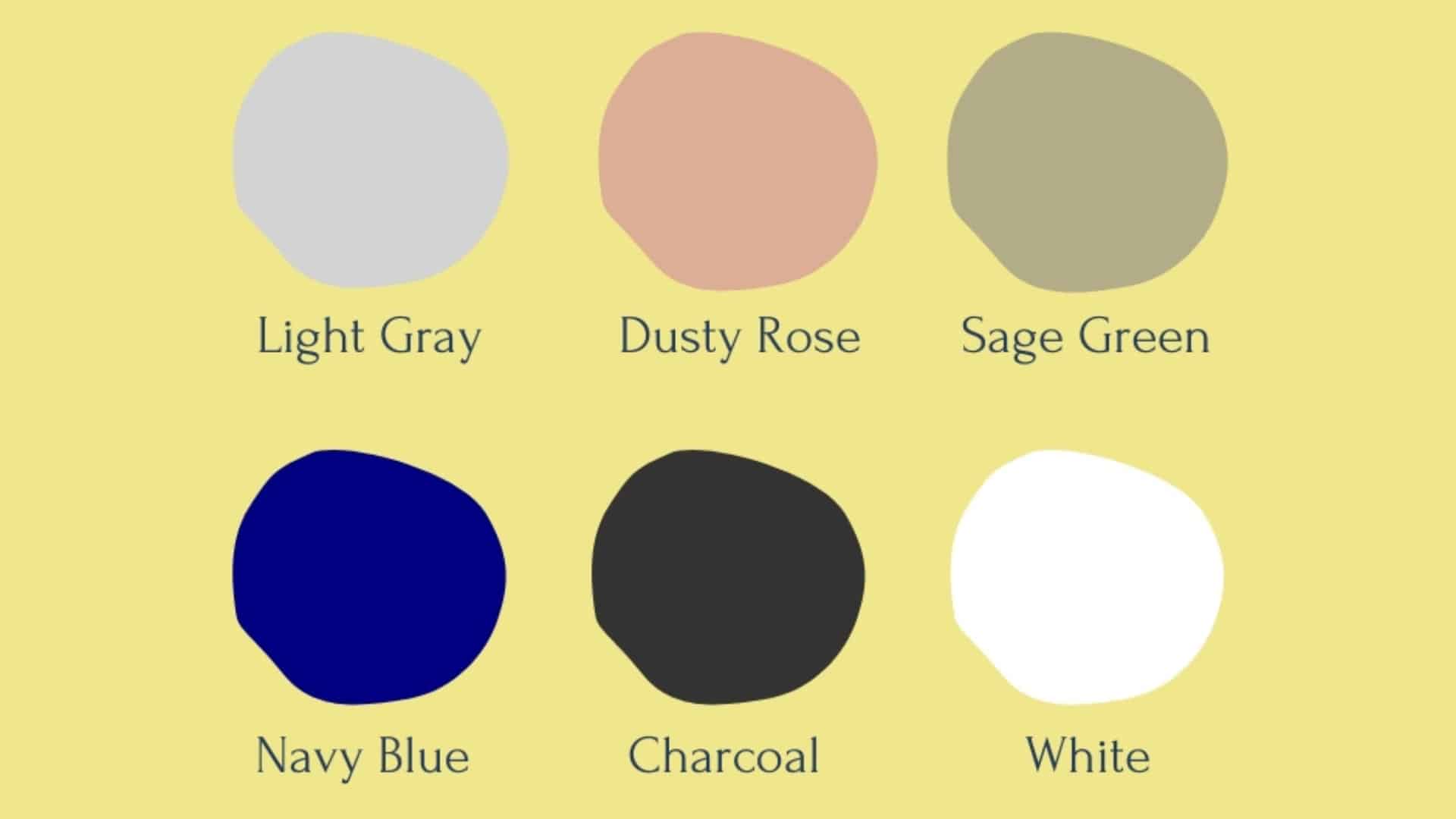
The digital khaki color (#F0E68C) pairs beautifully with a range of shades. White creates a crisp, clean contrast, while sage green adds a soft, earthy vibe. Dusty rose brings a romantic, feminine touch, perfect for both fashion and decor.
Light gray offers a modern, minimalist balance to khaki’s warmth. For a classic and bold contrast, navy blue works especially well in smart-casual styles.
Charcoal adds depth, making it ideal for sharp designs and formal outfits. These colors highlight khaki’s versatility, making it suitable for everything from clothing and interiors to branding and digital design.
How Khaki is Used in Design
Khaki is one of the most versatile colors in design because it works well with almost everything. Its natural, earthy tone makes people feel calm and comfortable. You can find khaki being used in the main areas of design.
1. Fashion
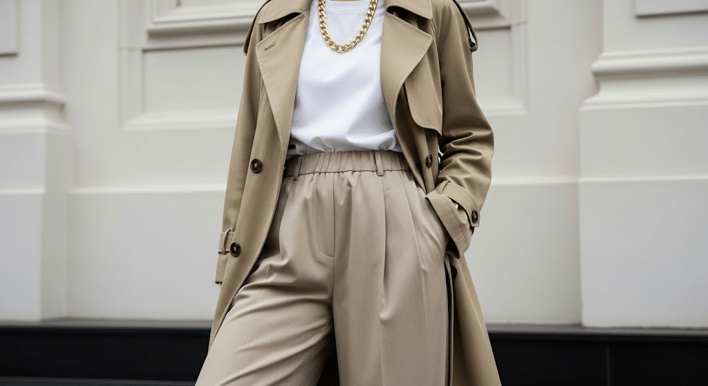
Khaki is a wardrobe staple that never goes out of style. From classic khaki pants and cargo shorts to trendy jackets and dresses, this color works for both casual and semi-formal occasions.
Many school uniforms and work clothes use khaki because it’s practical, hides dirt well, and looks professional. Fashion designers love khaki because it pairs perfectly with almost any other color, making it easy for people to create stylish outfits. This flexibility makes it easy to adapt khaki to almost any personal style.
2. Interior Design
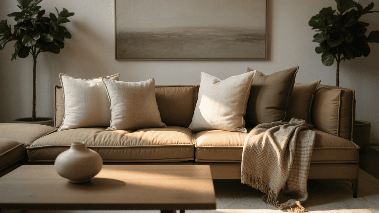
Interior designers often choose khaki for walls and decor because it creates a warm, welcoming feeling in any room. This neutral color works as a perfect background that doesn’t compete with furniture or artwork.
Khaki paint makes small rooms feel bigger and brighter, while khaki furniture and accessories add an earthy, natural touch. It’s popular in bedrooms and living rooms for a relaxed, comfortable feeling.
3. Branding
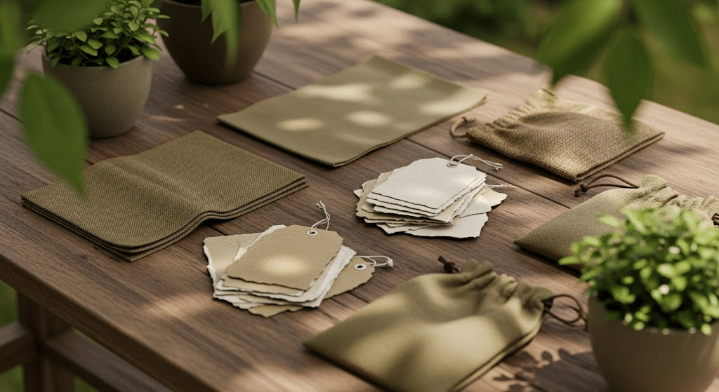
Many companies use khaki in their logos and marketing because it represents nature, reliability, and trust. Outdoor brands, such as hiking gear companies and camping equipment makers, often choose khaki to show their connection to the natural world.
Eco-friendly businesses also love khaki because it suggests environmental awareness and sustainability. The color helps these brands communicate that they care about the earth and outdoor experiences.
Khaki Color in Fashion and Outfit Ideas
Khaki color is incredibly versatile in fashion, working well for both casual and polished looks. Its soft, neutral tone allows it to blend perfectly with other colors and textures. Here are some unisex outfit ideas to help you style khaki effortlessly:
1. Casual Khaki & White Combo
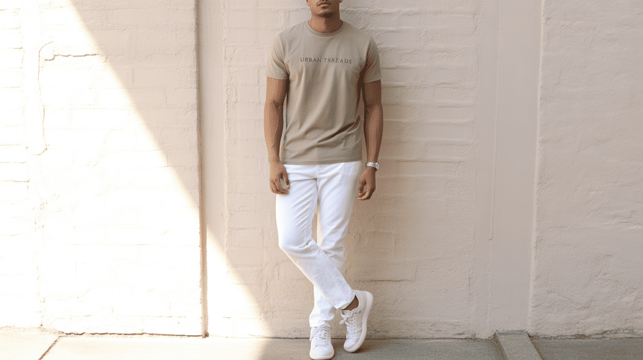
For a clean, easygoing everyday look, pair a khaki t-shirt or lightweight shirt with white jeans or shorts. This pairing creates a fresh contrast that’s perfect for warm weather or relaxed outings.
Finish the outfit with white sneakers or canvas shoes and simple accessories like a watch or tote bag to keep the look minimal and stylish.
2. Khaki and Denim Layers
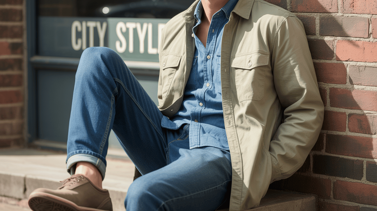
Layering khaki with denim is a timeless combination that works in any season. Try wearing a khaki overshirt or jacket over a classic denim shirt or with a pair of well-fitted blue jeans.
The texture of denim complements the softness of khaki, and you can complete the look with boots or sneakers for a comfortable and laid-back vibe.
3. Smart-Casual in Khaki and Navy
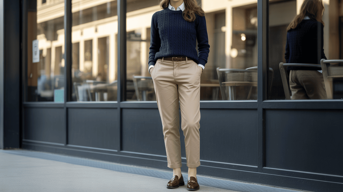
Khaki and navy blue make a refined and balanced outfit for work or semi-formal occasions. Pair khaki chinos or trousers with a navy button-down shirt or fine-knit sweater.
Add loafers or clean white sneakers, depending on the setting. This smart-casual combo is great for meetings, dinners, or anywhere you want to look polished but not overdressed.
4. Streetwear with Khaki Basics

For an effortless street-style outfit, wear khaki joggers or cargo pants with a bold graphic t-shirt and a lightweight bomber or utility jacket.
This look blends comfort with trendiness, making it great for weekends or casual city days. Add high-top sneakers, a beanie, or a crossbody bag to give the outfit more edge and individuality.
5. Cozy Khaki Layers for Fall
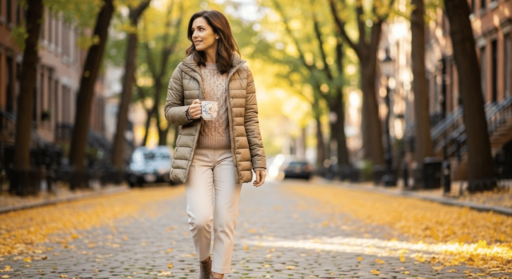
Khaki is ideal for layering during cooler months. Try a khaki puffer jacket, trench coat, or parka over a neutral hoodie or knitwear, matched with joggers or straight-fit jeans.
This combination creates warmth without sacrificing style. Earth-toned accessories like scarves, beanies, and boots complete the cozy autumn look while keeping things muted and seasonal.
Summing It Up
Now you know everything about khaki color, from its dusty origins in ancient Persia to its modern uses in fashion, design, and digital art.
This incredible neutral shade proves that sometimes the most powerful colors are the ones that don’t shout for attention. Khaki color works so well because it’s like a good friend: reliable, calm, and gets along with everyone.
If you’re choosing paint for your bedroom, picking out clothes for work, or designing a website, khaki gives you endless possibilities. Next time you see this earthy tone, you’ll appreciate just how special and flexible khaki really is in our everyday lives.
What’s your favorite way to use khaki? Share your thoughts in the comments below!
Frequently Asked Questions
Can Khaki Be Worn All Year Round?
Yes. Khaki works in every season by pairing it with lighter fabrics in summer and layered textures like wool or denim in colder months.
Does Khaki Look Better with Silver or Gold Accessories?
Both work well. Gold creates a warmer appearance, while silver gives khaki outfits a cleaner, more modern, and understated finish.
Is Khaki Suitable for Professional Office Wear?
Yes. Khaki trousers, blazers, or skirts, paired with structured pieces, create a polished look suitable for many business-casual workplaces.
Does Khaki Fade Easily Over Time?
Quality khaki fabrics hold color well, but frequent washing and strong sunlight may gradually lighten the shade.
Is Khaki a Good Choice for Minimalist Wardrobes?
Yes. Its neutral tone pairs well with many colors, making it a practical option for creating multiple outfits with fewer pieces.