A room can have all the furniture it needs and still feel unfinished. Sometimes, a few crisp colors, classic patterns, and personal details are enough to give it more character.
These preppy room ideas bring together stripes, checks, florals, neat bedding, natural textures, and warm metal finishes. The finished look feels organized without becoming cold or overly formal.
You can lean coastal with navy and white, keep things soft with muted pastels, or add stronger shades such as coral, pink, and green. Start with the ideas that suit your room and daily routine, then build the style one layer at a time.
Core Elements of Preppy Style
Preppy decor depends on classic colors, clear patterns, neat layouts, and a mix of smooth and natural materials. Each part should connect to the others without making the room look too matched.
| Element | Common Choices | How to Use It |
|---|---|---|
| Colors | Navy, white, green, coral, blush, and sky blue | Choose two main colors and one smaller accent shade |
| Patterns | Stripes, gingham, plaid, florals, and trellis | Mix one large print with one or two smaller patterns |
| Materials | Wicker, cane, linen, cotton, and wood | Use natural materials to soften crisp bedding and furniture |
| Finishes | Brass, gold, lacquer, and polished wood | Add them through lamps, frames, handles, and small furniture |
| Details | Monograms, scallops, framed prints, and neat storage | Repeat a few details instead of filling every surface |
Stripes, checks, and florals bring order, while soft fabrics and woven pieces keep the space comfortable. Navy and white create a classic base, while pink, coral, green, and pale blue add more personality.
The same designer fabric secrets used for upholstery can help you combine prints and materials. Repeat colors, change pattern sizes, and leave plain space between stronger designs.
How to Use This Guide
You do not need to apply all ideas. Choose two or three updates that suit your room size and living situation.
In a small bedroom or dorm, you might begin with striped bedding, one patterned pillow, and a brass lamp. A larger room can support wallpaper, a larger rug, a statement headboard, or a furniture update.
A connected room does not require a full matching set. Look for pieces that share a color, finish, or pattern. Navy stripes, white bedding, green trim, and wicker can work together even when each piece comes from a different place.
Renters can focus on rugs, curtains, bedding, lamps, framed prints, and removable wallpaper. Homeowners may also consider painted trim, permanent wallpaper, or built-in storage. These personal styling ideas can help you use furniture and decor you already own.
Preppy Room Ideas for a Polished Yet Playful Space
A preppy room should feel neat but still personal. The ideas below explain how each detail works and include clear advice about where it fits and how to use it well.
Begin with the bed, rug, walls, or curtains because these areas make the biggest visual difference. Add smaller accessories after the main colors and patterns are in place.
1. Layer Stripes, Plaids, and Florals for Balanced Pattern Play
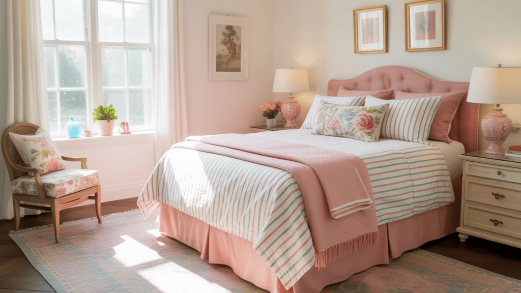
Start with one main print on a large surface, such as a striped rug, plaid duvet, or floral headboard. Add one or two smaller prints through pillows, curtains, or a throw. Keep one color consistent across every design so the mix feels connected. Using different pattern sizes also prevents the prints from competing.
Best for: Bedrooms that already have a simple color palette
Practical tip: Use your boldest pattern on one large item, then choose smaller and quieter prints for the pillows and curtains.
2. Use Pink as a Confident Preppy Accent
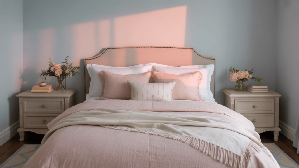
Pink softens strong furniture lines and darker shades without making the room feel too sweet. Blush creates a quiet look, coral adds warmth, and bright pink brings more energy. Use it on one noticeable feature, then support it with smaller details in white, navy, green, wood, or brass.
Best for: Teen rooms, guest bedrooms, and light neutral spaces
Practical tip: Choose one main pink item, such as a headboard or chair, then repeat the color once or twice through smaller accessories.
3. Contrast Light and Dark Shades for Instant Impact
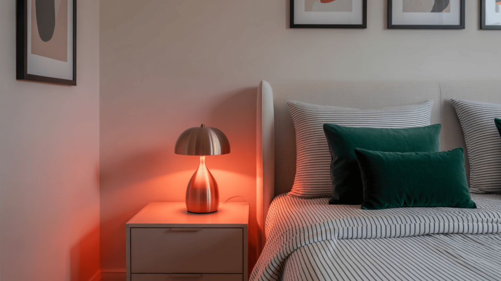
Navy, charcoal, or deep green walls can make white bedding and pale furniture stand out. This contrast gives the room a clear focal point and stronger shape. In a small or dim room, limit the dark color to one wall and use mirrors, light curtains, and warm lamps to prevent the space from feeling closed in.
Best for: Medium or large rooms with good natural light
Practical tip: Paint a large sample on the wall and check it in the morning, afternoon, and evening before choosing the final color.
4. Mix Classic Elements with Modern Decor for Character
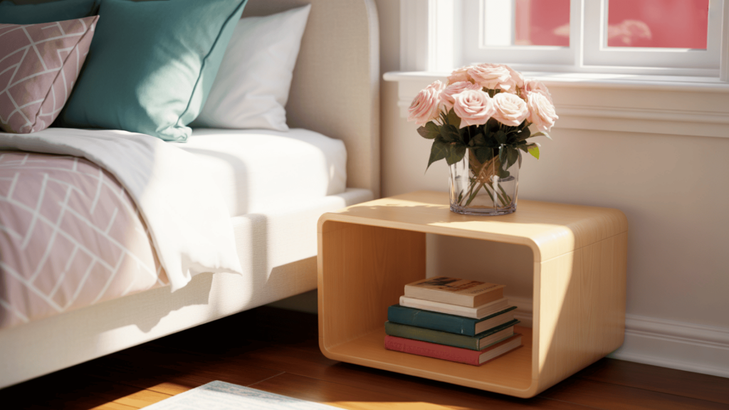
Pair traditional pieces, such as a carved dresser or pleated lamp, with clean furniture and simple artwork. Let one style lead while the other plays a supporting role. Repeating colors across old and new pieces keeps the room connected and stops it from looking like two separate design plans.
Best for: Rooms with inherited, antique, or secondhand furniture
Practical tip: Keep most furniture in one style, then add only two or three pieces from the other style for contrast.
5. Build a Soft Palette with Muted Pastels
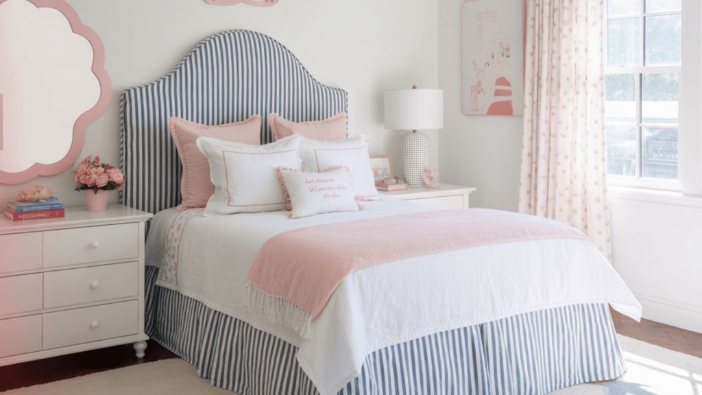
Sky blue, sage, peach, and blush can add color without making the room feel loud. Pick one pastel as the main shade and use the others in smaller amounts. White, cream, pale wood, and woven materials give the eye a break and help the softer colors remain clear.
Best for: Small bedrooms and rooms with soft daylight
Practical tip: Choose one pastel for the bedding or walls, then use the other pastel shades only on small items such as pillows and lamps.
6. Personalize with Monogrammed Bedding and Accessories
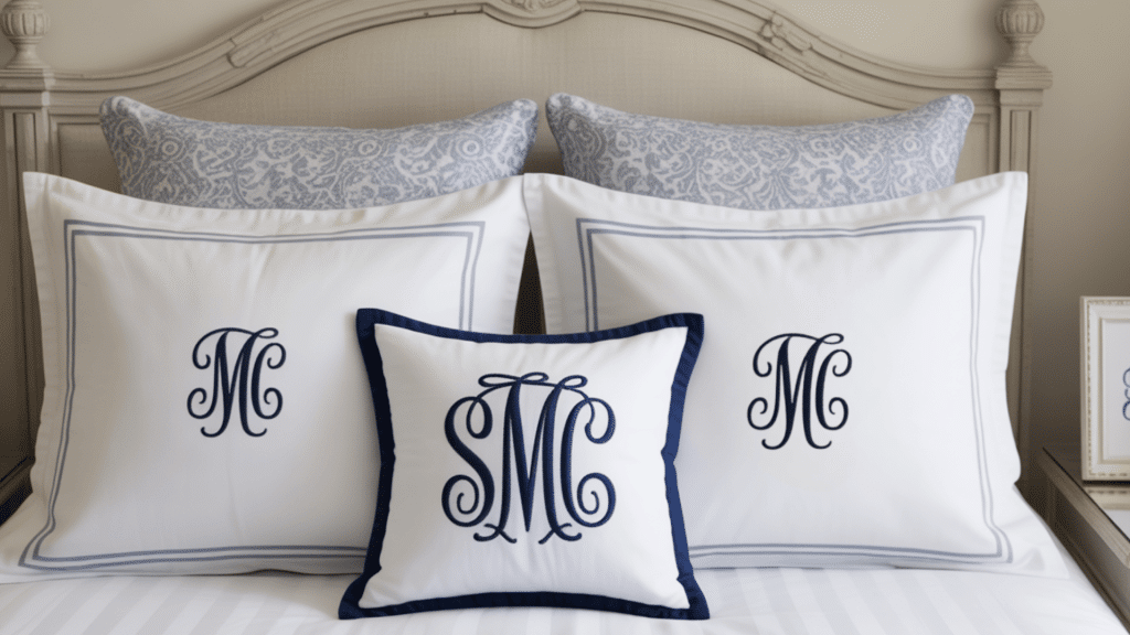
Monograms bring a personal touch without taking up more floor or wall space. Add initials to pillowcases, towels, storage bags, or one framed fabric piece. Choose a thread or border color that already appears elsewhere so the detail feels like part of the room rather than a separate feature.
Best for: Bedrooms, dorms, guest rooms, and shared bathrooms
Practical tip: Add initials to only one main item, such as a pillowcase, and avoid repeating them across every fabric surface.
7. Bring Coastal Prep Style into Your Space
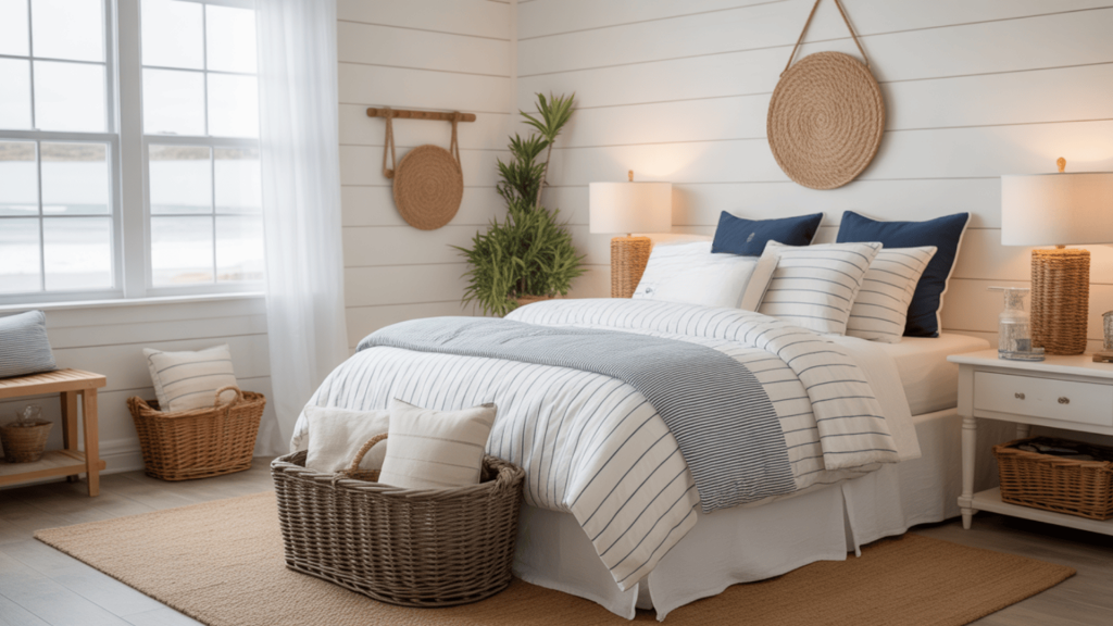
Use navy, white, pale blue, and sandy beige with striped cotton, wicker, linen, and light wood. These colors and materials suggest a coastal setting without needing obvious beach signs. One striped rug and a few woven details are usually enough to establish the look.
Best for: Bright bedrooms, guest rooms, and relaxed family homes
Practical tip: Let the colors and woven materials create the coastal feel instead of adding signs, anchors, shells, and boat decor.
8. Add Patterned Wallpaper for Texture and Interest
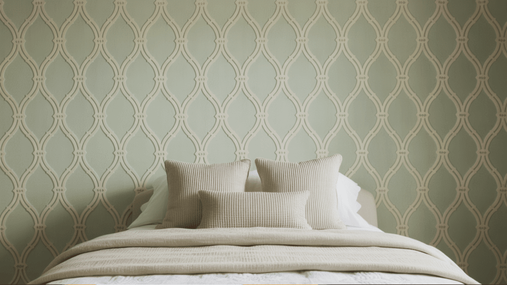
Gingham, trellis, botanical, and small floral wallpaper can set the color direction for the whole room. Use it behind the bed, desk, or bookcase if covering every wall feels too busy. Pull one or two shades from the print into the bedding and accessories so the wall connects to the rest of the space.
Best for: Accent walls, powder rooms, and rooms with plain furniture
Practical tip: Choose bedding and curtains after selecting the wallpaper so you can match them to colors already in the print.
9. Layer Textures for a Lived-In Look
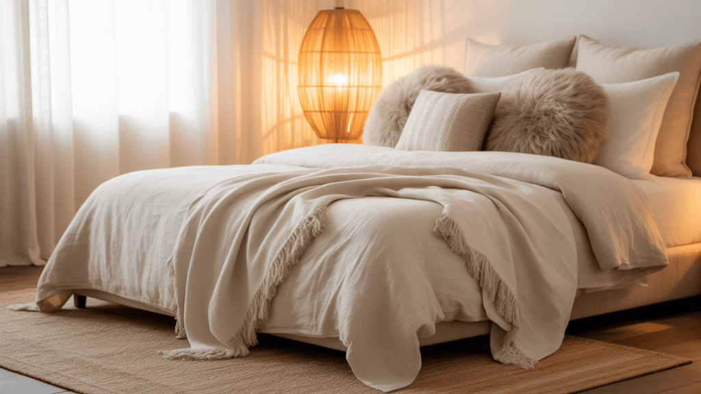
Mix smooth cotton bedding with linen curtains, a woven rug, a wicker lamp, or a knitted throw. Texture is useful when the room needs more depth but already contains enough color or pattern. Spread these materials around the room instead of placing all woven pieces in one area.
Best for: Neutral rooms that feel flat or unfinished
Practical tip: Add one soft texture, one woven texture, and one smooth surface instead of bringing in another busy print.
10. Combine Bright Pops with Neutral Foundations
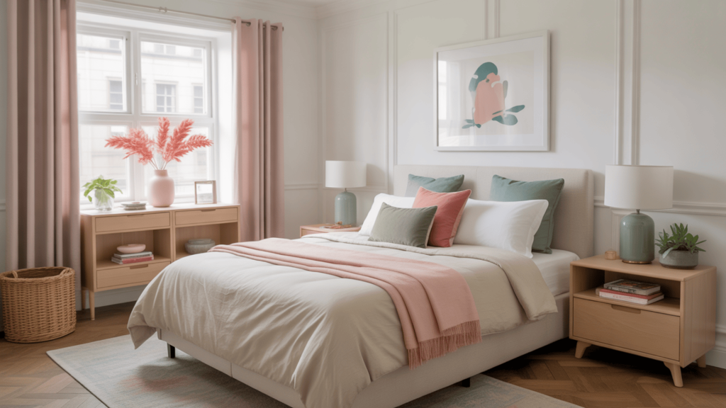
Begin with white, cream, beige, or pale gray on the largest surfaces, then add stronger color through lamps, pillows, art, and small furniture. Repeat each accent shade in at least two places. This keeps the color from looking random and allows you to update the room later without replacing expensive pieces.
Best for: Rental rooms and spaces with neutral furniture
Practical tip: Pick two bright colors and repeat each one in two small areas, such as a pillow and a piece of artwork.
11. Use Striped Textiles to Ground the Design
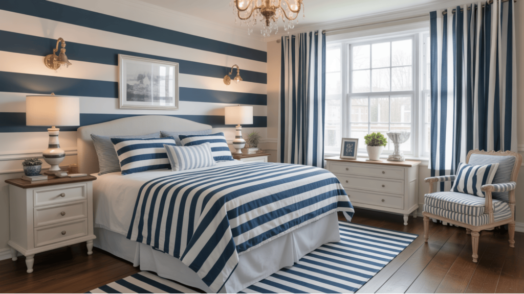
Wide stripes feel casual, while narrow stripes look more traditional. Use them on one large feature, such as a rug, curtains, duvet, or chair. If the stripe is strong, keep nearby bedding or upholstery simple so the pattern has enough room to lead the design.
Best for: Rooms that need clearer lines or stronger visual order
Practical tip: Choose only one large striped item and keep the other large fabric surfaces plain or lightly patterned.
12. Add Scalloped Edges for a Soft Finish
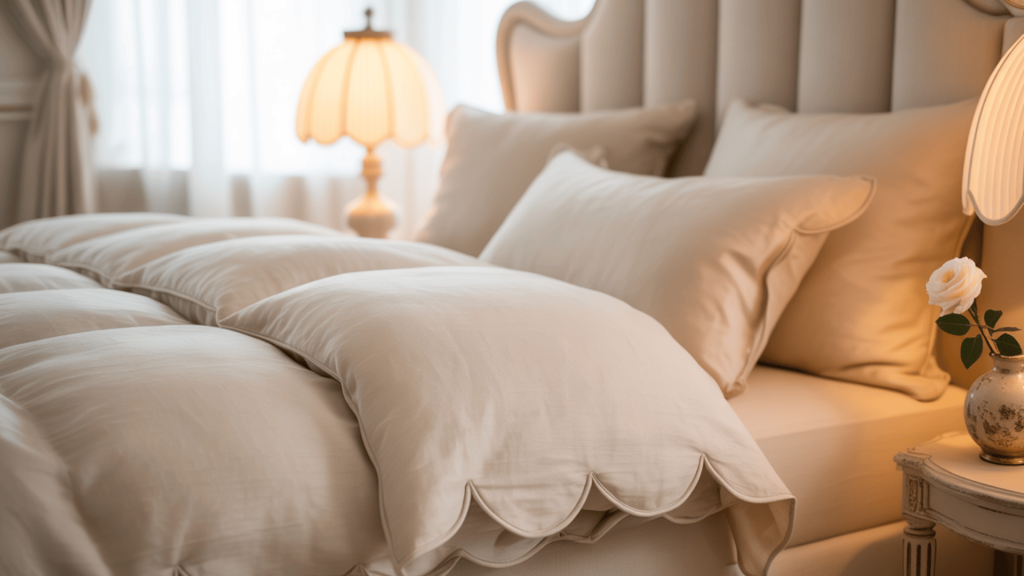
Scalloped mirrors, lampshades, trays, headboards, and pillow trim soften the straight lines found in beds, shelves, and striped fabric. Use one noticeable scalloped piece and repeat the shape once in a smaller detail. This keeps the room playful without making it feel themed.
Best for: Rooms with square furniture and strong geometric patterns
Practical tip: Use one large scalloped item, such as a mirror, and repeat the curved shape once through a smaller item like a tray.
13. Swap in Brass or Gold Hardware for Warmth
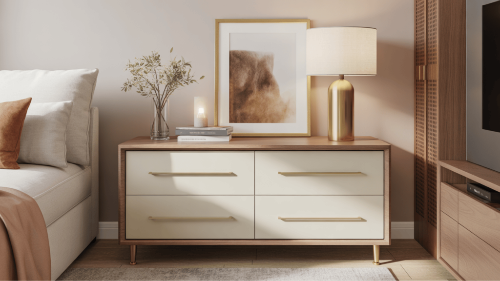
Replacing plain knobs and drawer pulls can update basic furniture without buying a new dresser or desk. Brass works with navy, green, pink, white, and natural wood. Connect it to a lamp base, curtain rod, or frame so the finish feels repeated rather than accidental.
Best for: Renters, beginners, and simple furniture updates
Practical tip: Measure from the center of one screw hole to the center of the other before ordering new handles.
14. Add Geometry with Grid or Trellis Prints
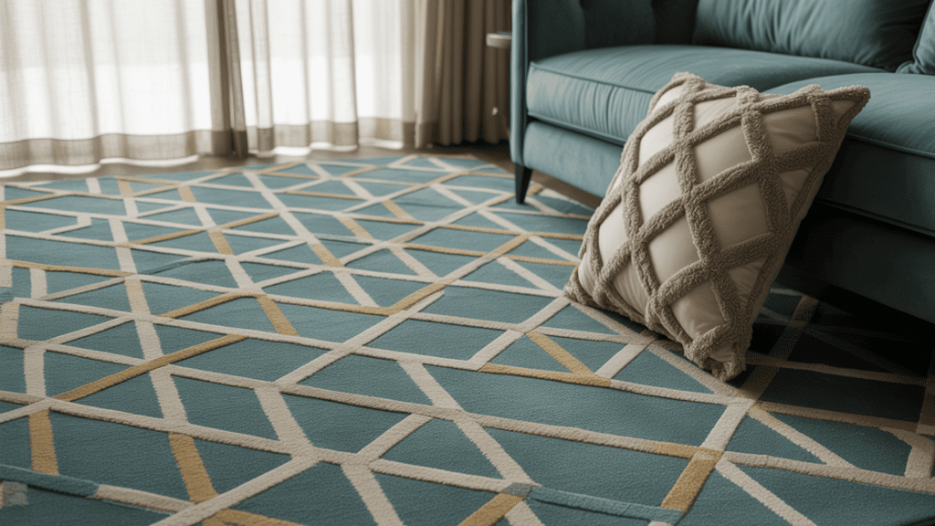
Grid and trellis prints bring order and work well beside softer floral or leafy designs. Use them on wallpaper, a rug, curtains, or a few cushions. Pair a large geometric print with a smaller natural pattern, and connect both through one shared color.
Best for: Offices, bedrooms, and rooms with floral furnishings
Practical tip: Pair a large grid or trellis print with a much smaller floral so both patterns remain easy to see.
15. Blend Vintage Finds with Modern Pieces
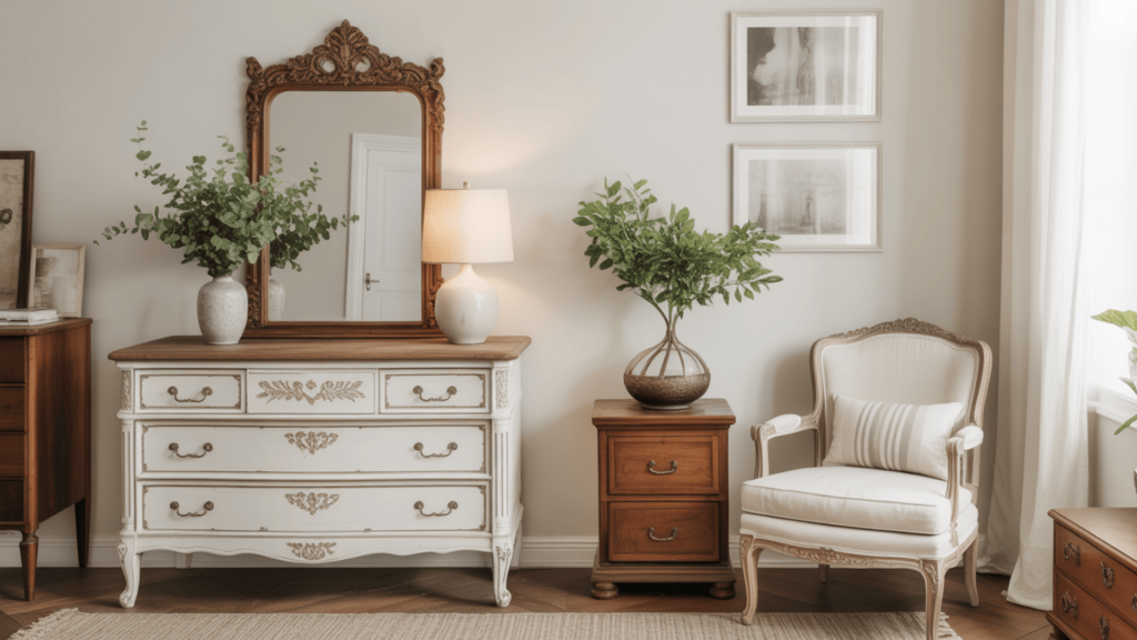
A vintage dresser, mirror, chair, or bedside table can add history and character. Pair it with simpler furniture so the room does not feel like a full period setting. Look for solid construction and useful storage rather than buying an older item only for appearance.
Best for: Rooms that feel too new or look like everything came from one store
Practical tip: Start with one vintage piece, then place a simple modern lamp or artwork beside it to create balance.
16. Anchor the Room with Blue and White Decor
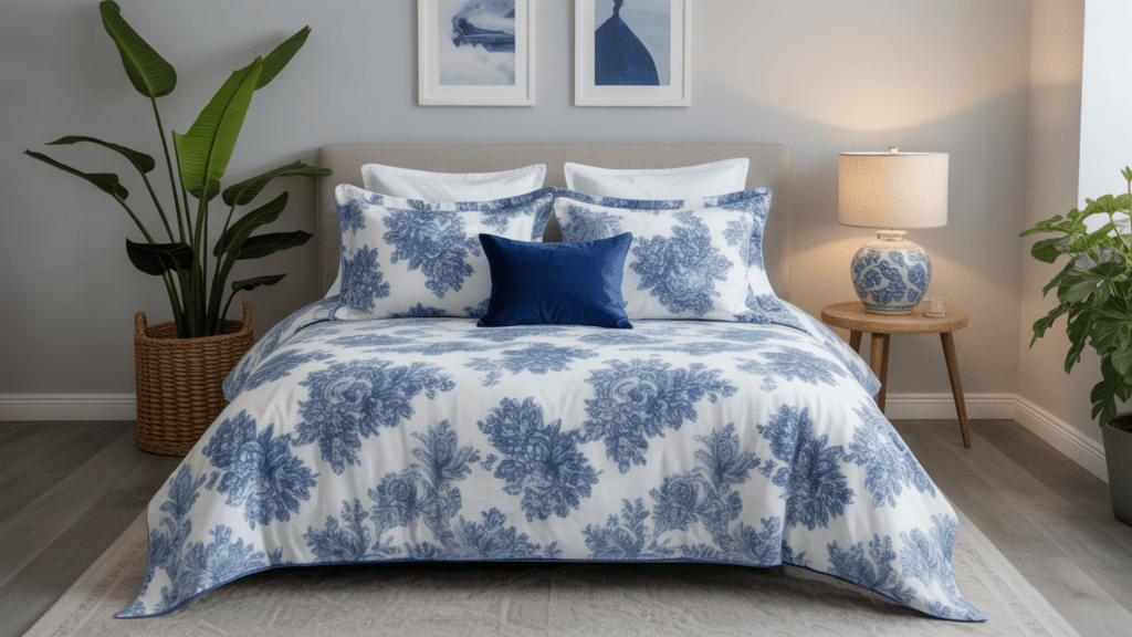
Blue and white create a clean base that works throughout the year. Mix navy, medium blue, and pale blue instead of matching every item exactly. Add a third shade, such as green, coral, tan, or warm brown, to keep the room from feeling cold.
Best for: Bedrooms, bathrooms, living rooms, and guest spaces
Practical tip: Use at least two shades of blue and add one warm material, such as wood or wicker, to soften the white areas.
17. Repeat Patterns Sparingly for Balance
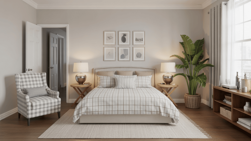
Repeat one print in two or three small places to connect separate areas. A plaid may appear on a throw, a pillow, and fabric inside a frame. Leave plain space between each repeat so the design remains noticeable and does not become a fully matched set.
Best for: Rooms with several colors or mixed furniture styles
Practical tip: Repeat the same pattern no more than three times and place each repeat in a different part of the room.
18. Add Freshness with Greenery and Florals
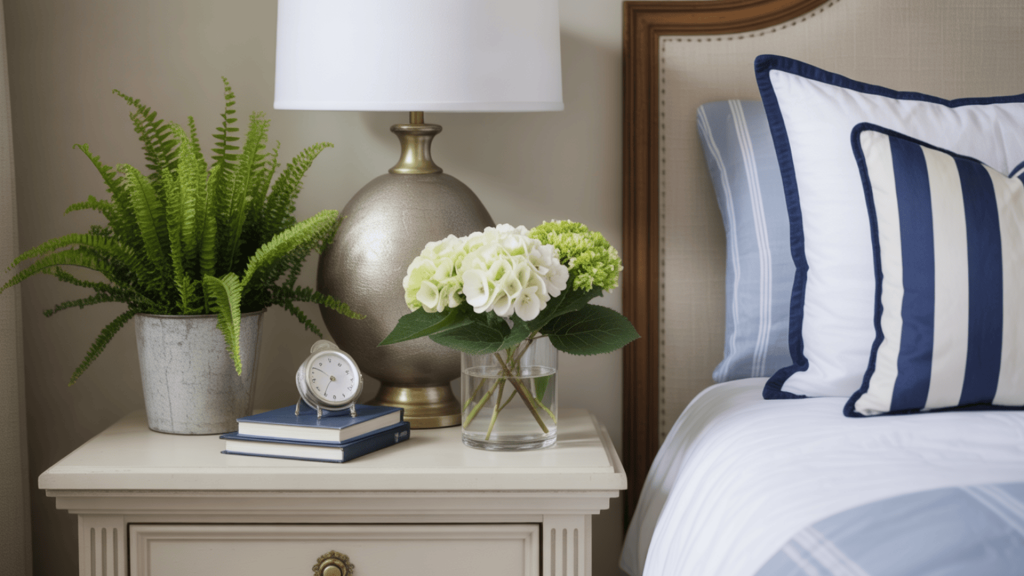
Plants and flowers soften clean furniture lines and introduce natural color. Hydrangeas, ivy, ferns, and simple leafy stems work well with blue, white, pink, and green rooms. Choose live plants based on the available light, not only their appearance.
Best for: Dressers, desks, windowsills, and empty corners
Practical tip: Place one medium or large plant in an empty area instead of spreading several small pots across every surface.
19. Highlight Your Bed with a Statement Headboard
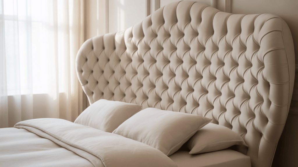
A scalloped, patterned, cane, or contrast-trimmed headboard can become the room’s main feature. Keep the bedding quiet when the headboard has a strong print. When the headboard is plain, you can use more color and pattern on pillows, quilts, or throws.
Best for: Bedrooms with limited wall art or simple furniture
Practical tip: Measure the mattress width and the open wall space before buying so the headboard looks balanced behind the bed.
20. Curate a Gallery Wall That Tells a Story
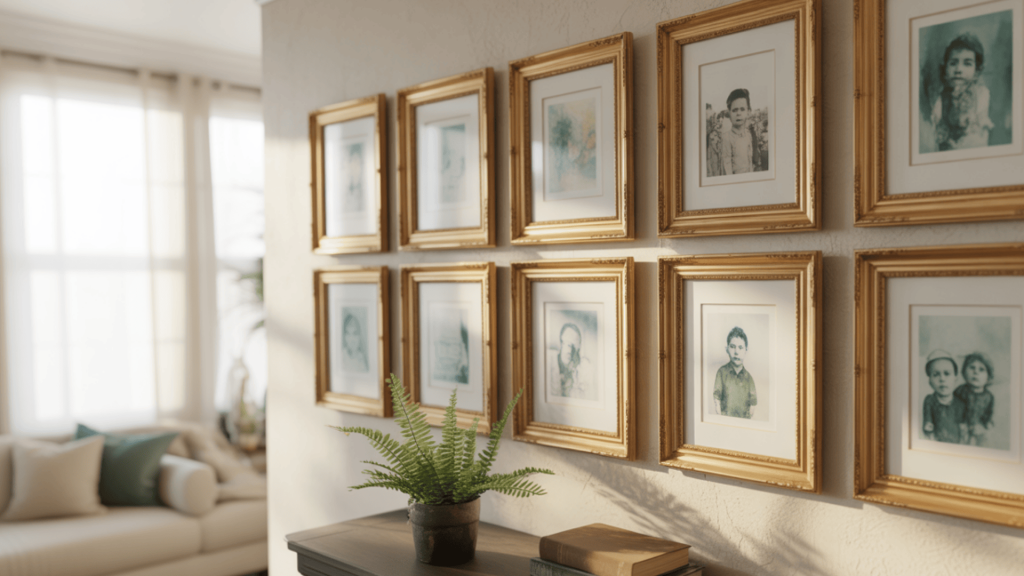
Combine family photographs, maps, drawings, fabric samples, and prints that have personal meaning. Use similar frame colors or matting to connect different subjects. Arrange everything on the floor first so you can test the spacing and overall shape before making holes in the wall.
Best for: Blank walls above beds, desks, sofas, or dressers
Practical tip: Lay every frame on the floor first and keep the same space between each one before copying the layout onto the wall.
21. Layer Bedding for Comfort and Depth
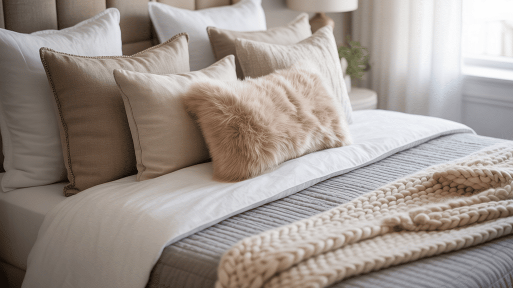
Start with clean sheets, then add a quilt, coverlet, or light duvet. Finish with a folded throw and a few pillows in different sizes. Use one patterned layer and keep the others mostly plain. Each item should be easy to remove so the bed remains practical.
Best for: Main bedrooms and guest rooms
Practical tip: Use one patterned quilt or duvet, then keep the sheets, throw, and most pillows in plain coordinating colors.
22. Choose Lighting That Adds Character
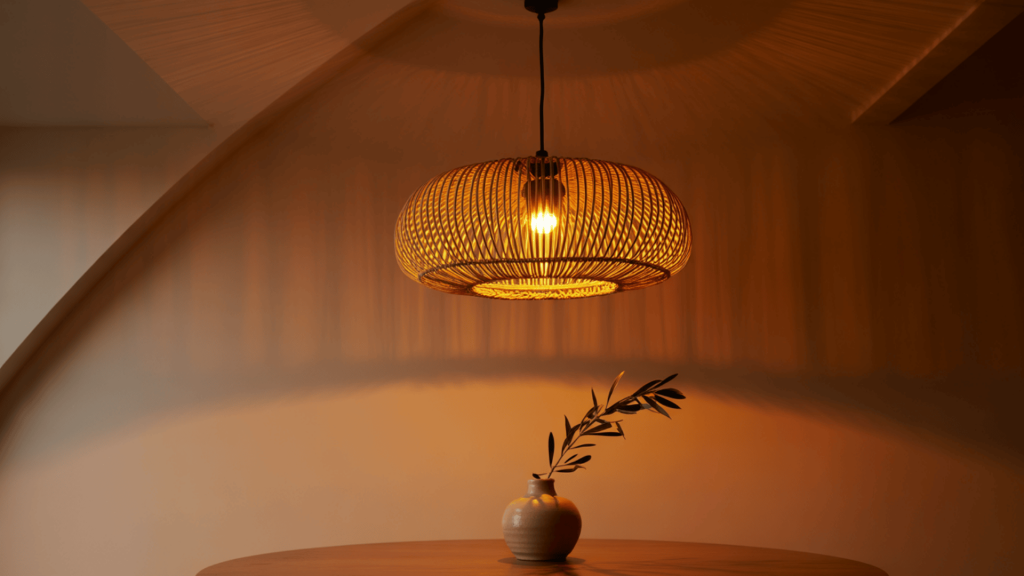
Brass sconces, ceramic lamps, glass bases, pleated shades, and woven pendants can add shape and texture without filling more wall space. Use at least two light sources, such as an overhead fixture and a bedside lamp, so the room works for both general use and reading.
Best for: Bedrooms with limited natural light
Practical tip: Place a lamp beside the bed or desk and use a warm bulb so the room has softer light at night.
23. Mix Traditional Prints with Playful Details
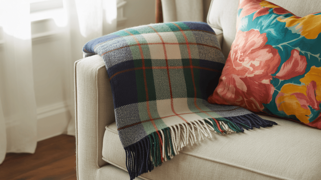
Pair plaid, stripes, or florals with a brighter lamp, unusual pillow, colorful print, or fun decorative object. The playful item should share at least one color with the traditional pattern. This small connection keeps the room lively without changing the overall style.
Best for: Teen bedrooms, dorm rooms, and casual guest rooms
Practical tip: Choose two playful accessories that repeat a color already found in the room’s main plaid, stripe, or floral print.
24. Add Wicker or Cane for Texture

Wicker, cane, and rattan bring warmth beside painted furniture and smooth bedding. Add them through a chair, basket, dresser front, lamp, mirror, or bench. Woven baskets are especially useful because they provide texture and storage at the same time.
Best for: Coastal, neutral, and blue-and-white rooms
Practical tip: Use one woven furniture piece or two smaller woven accessories instead of filling the room with matching rattan items.
25. Try Color Blocking for Clean, Simple Contrast
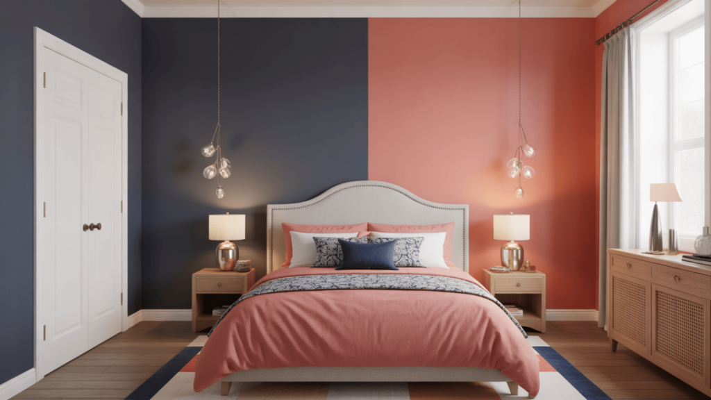
Color blocking uses larger areas of solid color instead of several busy prints. You might pair navy walls with cream bedding and a coral chair, or white walls with green curtains and blue furniture. Repeat each chosen shade around the room so the strong color areas feel related.
Best for: Modern preppy rooms and people who prefer solid fabrics
Practical tip: Choose two colors for the largest surfaces, then use a third color only on one or two smaller items.
Once you have chosen your main colors, patterns, and materials, step back and check the full room. Remove any item that competes with the main feature or makes the layout feel crowded.
Tips for Executing Your Preppy Room
You now have several ideas to choose from, but using too many at once can weaken the overall look. A clear starting point will help you make better choices and avoid buying pieces that do not work together.
- Choose one starting point: Build the room around a rug, headboard, wallpaper print, or piece of artwork you already like.
- Limit the main colors: Use two main shades and one smaller accent color.
- Vary pattern sizes: Pair a large stripe or floral with a smaller check, grid, or plain fabric.
- Repeat colors carefully: Use each accent shade at least twice.
- Leave clear surfaces: Avoid filling every shelf, wall, and table.
- Repeat finishes: Use the same brass, wood, or woven finish in two or three places.
- Think about daily use: Choose storage, lighting, seating, and bedding that fit your routine.
- Measure before buying: Check the size of rugs, furniture, curtains, and artwork first.
- Make changes gradually: Add one piece at a time and check how it works.
- Edit the room regularly: Remove items that no longer support the color scheme or serve a purpose.
Once the main colors and materials are in place, smaller details become easier to choose. You will be able to see which pieces support the room and which ones only add clutter.
Frequently Asked Questions
Can preppy decor work in a small room?
Yes. Use lighter wall colors, one main pattern, and furniture with useful storage. A striped throw, brass lamp, framed print, and two coordinated pillows can create the style without using valuable floor or wall space.
How can I make a preppy room feel more grown-up?
Choose deeper colors, cleaner furniture lines, and fewer decorative objects. Navy, forest green, cream, dark wood, and aged brass often feel more mature than several bright pastels or fully matched furniture sets.
Does a preppy room need to include pink?
No. Blue, green, cream, tan, burgundy, yellow, and white can all create a preppy look. Focus on classic patterns, neat layering, balanced colors, natural textures, and traditional details instead of relying on one shade.
What type of artwork suits preppy decor?
Botanical prints, maps, simple landscapes, family photographs, line drawings, vintage sports images, and framed fabric samples can work well. Choose pieces with colors that connect to the furniture, rug, bedding, or curtains.
How can I change the room as my style develops?
Keep expensive items, such as furniture and large rugs, fairly neutral. Add stronger colors and patterns through pillows, lampshades, throws, art, and curtains because these pieces are easier and less costly to replace.
Conclusion
The best preppy room ideas combine order, color, and personality without making your space feel overly formal. A striped rug, clean bedding, brass lamp, or patterned headboard can give you a clear starting point.
I would begin with one item you already like and use it to choose the room’s main colors. From there, you can add texture through wicker, linen, wood, or one useful vintage piece.
You do not need to finish the room in one day. Let it grow as you find pieces that suit your taste and daily routine. Start with two or three updates, step back, and keep only the details that make your room more comfortable, useful, and personal.