Ever picked up a beauty product that looked perfect, only to regret it later? The truth is, great beauty buys rarely come down to luck. The clues are right in front of you, hidden in the packaging.
Most shoppers focus on hype, reviews, or trends, but those don’t always tell the full story. In this guide, you’ll learn how to read packaging like a pro and spot quality before you buy. Once you know what to look for, choosing the right products becomes faster, easier, and far more reliable.
Material Quality Signals Performance
The feel of a product in your hand reveals more than most people realize. Weight, texture, and durability often reflect the level of care that went into production. Cheap materials can hint at shortcuts, while solid construction suggests long-term use and better storage conditions.
You can spot strong material choices by paying attention to a few details:
- Thick glass or sturdy acrylic
- Smooth closures that click securely
- Pumps and droppers that feel precise
Well-built packaging also protects ingredients from air and light. That protection helps maintain product effectiveness over time. Brands that invest here rarely cut corners elsewhere and often prioritize ingredient stability.
Consistency Across the Brand Line
Strong brands stay consistent across all their packaging, and that consistency is a major quality signal. Fonts, colors, materials, and layout should feel connected from one product to the next. When everything looks cohesive, it shows attention to detail and a clear brand identity.
Inconsistent packaging can suggest rushed production or a lack of focus. Brands that refine every visual element tend to apply the same care to formulation and testing. Paying attention to these patterns helps you spot reliability before you even try the product.
Minimal Design Shows Confidence
Simple packaging often signals that a brand trusts its formula to stand on its own. Clean labels and uncluttered layouts make it easier to understand what you’re buying. Clear communication builds trust without overwhelming the buyer or creating confusion.
Flashy designs can still be effective, but they sometimes distract from weak formulas. Minimalist packaging usually highlights key ingredients and real benefits. That clarity helps you make faster and more confident decisions in busy stores.
Sustainability Is a Smart Clue
Eco-friendly packaging often signals a brand that looks beyond quick wins. Refillable containers, recycled materials, and low-waste designs show long-term thinking. Companies that care about their environmental footprint tend to bring that same care to product quality and sourcing.
Thoughtful sustainability also shows up in simple choices, like compact shapes, recyclable materials, and packaging that avoids unnecessary bulk. When a brand reduces waste without making the product harder to use, it often points to smarter planning and better overall design.
Functional Packaging Improves Daily Use
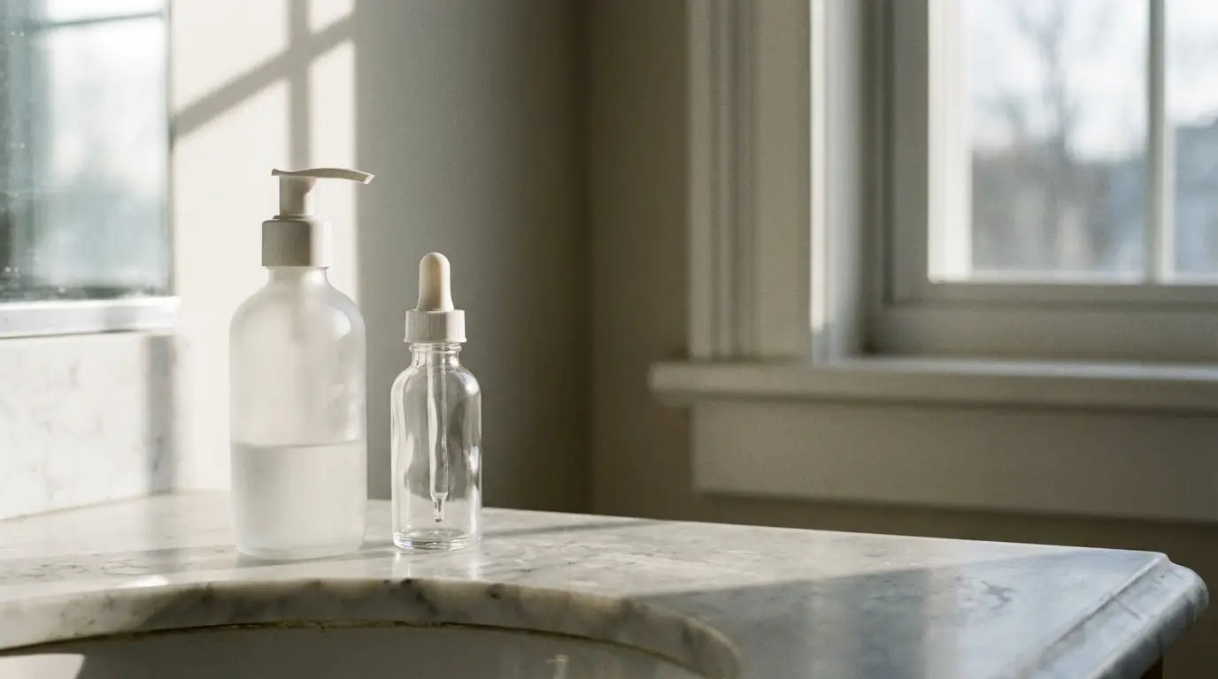
Good packaging should make your routine easier, not harder. Pumps should release the right amount, lids should close securely, and applicators should help prevent mess or waste. These small details can affect how often you use a product and how satisfied you feel with it over time.
Functional design also speaks volumes about the care that goes into a beauty product. In beauty and consumer packaging, design agencies like tether.com focus on how packaging looks, feels, protects the formula, and fits into daily habits. When packaging is easy to hold, simple to use, and built for real routines, it becomes a strong clue that the product was thoughtfully made.
Size and Proportion Reveal Value
The size of the packaging compared to the actual product can tell you a lot about value. Oversized containers with little product inside often signal marketing over substance. Well-proportioned packaging usually reflects honesty and thoughtful design, helping you avoid misleading presentations.
Take a moment to check how much product you’re actually getting. Compact, efficient packaging often means less waste and better usability. Brands that avoid unnecessary bulk tend to focus more on performance than appearance and prioritize practical, user-friendly experiences.
Color and Typography Influence Perception
Visual design choices shape how you interpret a product before you try it. Colors often hint at function, while fonts suggest tone and credibility. These subtle cues shape your expectations instantly, guide quick decisions, and reinforce brand identity and positioning.
Soft tones often suggest calming or gentle formulas. Bold colors can signal stronger ingredients or targeted treatments. Clean, modern fonts tend to reflect a more clinical or science-driven approach that appeals to results-focused buyers.
Transparency Builds Trust
Clear labeling makes a huge difference when comparing beauty products. Straightforward ingredient lists and honest claims show that a brand stands behind its formula. Confusing language or vague promises can signal the opposite and create doubt, especially when important details are missing.
Clear packaging should make key details easy to find, including:
- Ingredient highlights
- Usage directions
- Honest product claims
Brands that communicate clearly reduce buyer uncertainty. That openness builds confidence before the first use. Trust built early often leads to better overall satisfaction and fewer returns, helping you make faster, more informed purchasing decisions.
Spotting Great Beauty Buys Gets Easier
Learning to read the clues in beauty product packaging makes shopping a more confident experience. You begin to recognize patterns in quality, design, and usability without relying on guesswork. That skill helps you avoid disappointment and discover products that truly deliver.
Next time you browse, slow down and study the packaging before you buy. Great beauty often reveals itself through small, intentional details. Keep practicing, and your instincts will get sharper with every purchase.